Carol here, with a burning question: Are you, at times, daunted by colouring, especially 'big' floral images? If so, welcome to my world! While I do enjoy (usually...) dabbling with copics, Tombow/Zig markers (provided water is 'not' involved!) and pencils, reality is that oftentimes, my efforts aren't successful (which makes for a happy, well-fed recycle bin *grin*) or I don't have time/inclination to colour.
Today, my Uniko Studio DT Showcase features a 'round about' colouring technique that most of you are familiar with but...it's nice to have reminders now and again, right? Right!
Have you been following Kristina Werner's Distress Oxide blends series? Swoon! I selected a trio of her combinations - inks I had no idea would work so well together - to pair with various Uniko Studio images. NOTE: I mixed-and-matched oxides with regular distress inks, depending what I had in my collection.
My goals: to create cards with colour, minus the stress/time of full-fledged colouring and to highlight just how pretty outline stamps can be, left more or less, as is.
How about I let the photos do the talking...you'll see what I mean.
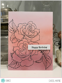
Card 1
Background panel: Spun Sugar, Abandoned Coral, Aged Mahogany
Sentiment: Simply Said
Because the image looked a bit 'flat', I went in with a couple of prisma pencils, just a bit darker than the actual distress inks to add some shading/depth to the rose petals.
Card 2
Background panel: Festive Berries, Worn Lipstick, Scattered Straw
Sentiment: Simply Said
Again, I used pencils to add depth/shading.
Card 3
Background panel: Chipped Sapphire, Pine Needles, Twisted Citron
Sentiment: Simply Said
Yes...more pencil...
Thank you for dropping by!


Beautiful cards and wonderful color blends, Carol! Very doable, indeed! Thanks for sharing. :)
ReplyDeleteI am absolutely loving your gorgeous blog! Thanks
ReplyDeleteI've been watching Kristina's videos and saved the color swatches to Pinterest. I also have been taking note of some Oxide colors I need to add. Since you don't like watercoloring you might have found your niche, Carol, because all of these look stunning, especially with the added pencil shading. Plus you have all those gorgeous Uniko stamps that work well for this technique.
ReplyDeleteSo pretty! Totally stealing your idea. :D
ReplyDeleteWell, these are all so beautiful! I love them, especially your second card. All the colors are so pretty!
ReplyDeleteYep, been watching Kristina's DOX blends ... and you've used them beautifully here, Carol! They're soft and dreamy with these lovely images ... and the touch of extra colour here and there adds a great sense of dimension! Hugs, Anita :)
ReplyDeleteSuch a creative and beautiful way to 'colour' in those beautiful stamps. Fabulous trio of beautiful cards. Thank you for the inspiration x.
ReplyDeleteI am with you ALL the way on coloring!! I think that's why I proudly embrace groupings of small elements! I've been saving her distress oxide color posts - I love what you've done - now I'm going to have to challenge myself to try it.
ReplyDeleteIt's a great idea to blend the background and stamp a delicate image on top!
ReplyDeleteI will try this soon! - Hope I can use some more of my beautiful flower stamps this way without hours of colouring! (sometimes I just havn't enough free time to do all I want to do...)
Hugs & Greetings grom Wiebke