Hello,
Carol here, with a burning question: Are you, at times, daunted by colouring, especially 'big' floral images? If so, welcome to my world! While I do enjoy (usually...) dabbling with copics, Tombow/Zig markers (provided water is 'not' involved!) and pencils, reality is that oftentimes, my efforts aren't successful (which makes for a happy, well-fed recycle bin *grin*) or I don't have time/inclination to colour.
Today, my
Uniko Studio DT Showcase features a 'round about' colouring technique that most of you are familiar with but...it's nice to have reminders now and again, right? Right!
Have you been following
Kristina Werner's Distress Oxide blends series? Swoon! I selected a trio of her combinations - inks I had no idea would work so well together - to pair with various Uniko Studio images. NOTE: I mixed-and-matched oxides with regular distress inks, depending what I had in my collection.
My goals: to create cards with colour, minus the stress/time of full-fledged colouring and to highlight just how pretty outline stamps can be, left more or less, as is.
How about I let the photos do the talking...you'll see what I mean.
Card 1
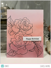
Background panel: Spun Sugar, Abandoned Coral, Aged Mahogany
Because the image looked a bit 'flat', I went in with a couple of prisma pencils, just a bit darker than the actual distress inks to add some shading/depth to the rose petals.
Card 2
Background panel: Festive Berries, Worn Lipstick, Scattered Straw
Again, I used pencils to add depth/shading.
Card 3
Background panel: Chipped Sapphire, Pine Needles, Twisted Citron
Yes...more pencil...
Hopefully, you'll come away with some new ink blending techniques to 'breathe life' into your Uniko Studio stamps. Easy to do...with results that can be both pretty and time-saving!
Thank you for dropping by!


